DATA VISUALISATION
REPORTS & DASHBOARDS
Report and Dashboard Production:
Presenting and analysing your data in charts, tables, gauges and indicators to provide new insights and inform decision making
A bespoke data solution is appropriate wherever there is a requirement for delivering data in a form that is not directly available.
You may already be using a data warehouse or datamarts, for example Orchard’s IMS and datamart solutions. While these provide simplified data access for reporting and dashboards, scenarios often arise where further data processing is necessary to produce a solution:
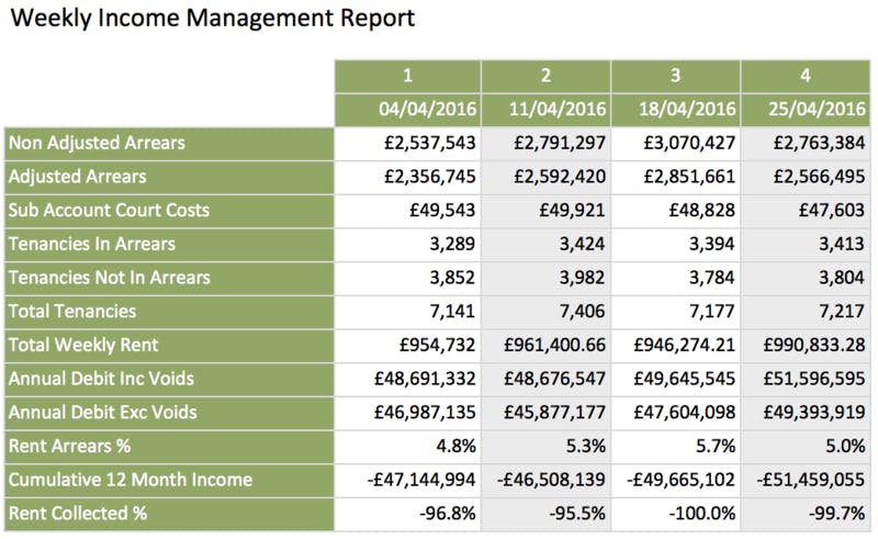
This data and reporting solution was developed to meet a requirement to adjust the arrears figures to take into account late payments. This adjusted data is simply not avilable within Orchard Housing, and cannot easily be acheivied using standard Business Objects reporting tools.
The solution also includes many other calculated values such as:
Weekly and monthly rent accounts are included enabling reporting of the adjusted arrears over weekly periods along with the other calculated values and combined with arrears actions summary. This sort of report could not be acheived using standard data and reporting tools.
See example snippet of the report:

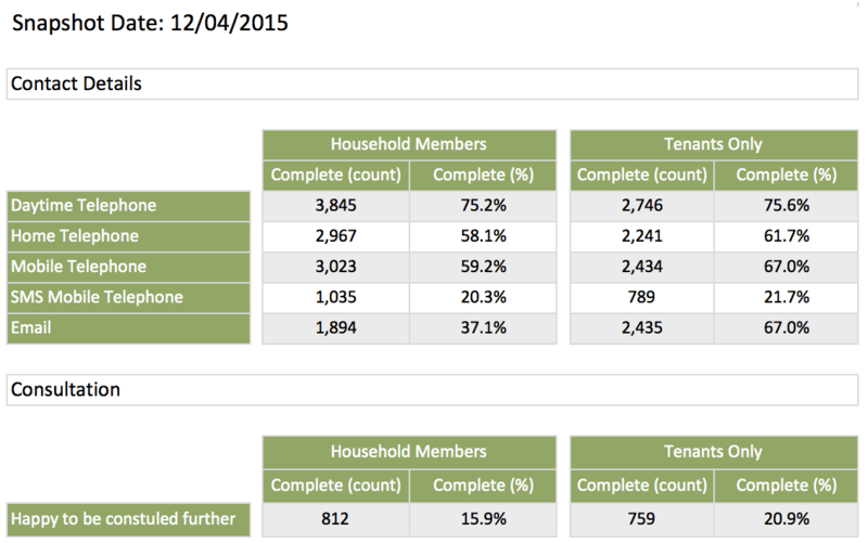
The requirement here was to take snapshots of Orchard Housing person data to enable monitoring over time and report on data quality in terms of the completeness (ie existance of valid data values) of each data item. This included standard data such as Date of Birth, Ethnicity, phone and email contact details etc and also custom data help in Orchard BPM EDR tables. By extracting the data into SQL Server it was possible to combine data from the two separate Orchard databases into a single table and so easily report on the whole data set.
In particular, the housing provider was interested into the impact of the customer census surveys they were undertaking, and were able to monitor this by taking snapshots before and after the surveys.
A custom Business Objects was developed to provide easy to use reporting functionality, and several reports were created as shown in the example.

This system uses existing rent payment data from Orchard Housing and applies an algorithm to evaluate the payment frequency and from that anticipated date of next payments. When expected payment are not received the report flags the period using colour coding to indicate the where there is a missing payment and whether is due soon.
So in the example report shown, the red rows indicate a missing payment, while the orange row indcates a payment is due soon. Additional parameters can be set to use a different colour coding to indicate where tenants in credit are getting close to being in arrears.

Get in touch to talk about your business and data analysis needs and find out what we can build for you
Contact UsRead more about the social housing enterprise data analysis services we can offer you
Report and Dashboard Production:
Presenting and analysing your data in charts, tables, gauges and indicators to provide new insights and inform decision making
Designing and delivering data models based on your requirements. This includes combining data from several sources, and summarising, aggregating, calculating or modifying data as needed